
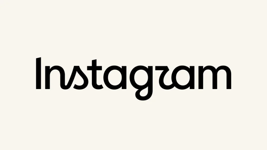

Instagram has unveiled a refresh of its wordmark, and the reaction from critics is not kind. The new design, which replaces the cursive typeface that has defined the brand for a decade, is being called "the perfect embodiment of AI slop" — a term used to describe generic, soulless content that looks like it was churned out by an algorithm rather than a human designer.
According to Ars Technica, the announcement came wrapped in the kind of corporate language that has become all too familiar in tech. Head of Instagram Adam Mosseri called the new wordmark "leaner and more modern, with references to the original and the simplicity and craft that's always made it Instagram."
Why Critics Call the New Instagram Logo "AI Slop"
The criticism centers on what the new design represents. The term "AI slop" refers to content that feels mass-produced, lacking any distinctive human touch or creative spark. Critics argue that the new Instagram wordmark perfectly captures this aesthetic — it is technically clean but emotionally empty.
As Ars Technica notes, the new wordmark is "accidentally being perfectly awful." The design appears to check all the boxes for modern branding — simplicity, legibility, scalability — but in doing so, it loses the character that made the original recognizable.
The Problem With "Leaner and More Modern" Design
Mosseri's framing of the redesign as "leaner and more modern" is precisely what bothers critics. The push toward minimalism in tech branding has produced a landscape where every major platform looks increasingly similar. When a brand like Instagram — which built its identity on creativity and visual expression — adopts a design that could have been generated by any AI tool, it sends a troubling message.
"Sure, Adam. Simplicity and craft are definitely what everyone thinks of when Instagram comes to mind." — Ars Technica
The redesign comes after a decade of the cursive typeface that users had come to associate with the platform. According to NewsCord, the new wordmark replaces that familiar design, marking a significant visual shift for the platform.
What This Means for Instagram's Brand Identity
The criticism reflects a broader concern about where design is heading in the age of AI. When a company as influential as Instagram makes a design choice that feels algorithmically generated, it raises questions about the future of creative work. The new wordmark may be functional, but it lacks the personality that made the original design memorable.
For users who have grown up with the cursive Instagram logo, this change represents more than just a visual update. It signals a shift in how the company views its own identity — and not necessarily in a positive direction.
Our Take: The New Instagram Logo Misses the Point
To put it plainly, this redesign feels like a step backward disguised as progress. The new Instagram wordmark may be cleaner and more modern in a technical sense, but it has lost the warmth and character that made the original distinctive.
In our view, this is what happens when companies prioritize algorithmic efficiency over human creativity. The result is a logo that could belong to any tech company — and that is precisely the problem. Instagram built its brand on being a platform for visual expression. A wordmark that looks like it was generated by an AI tool undermines that identity.
The backlash to this redesign should serve as a warning. Users notice when brands lose their soul in the pursuit of modernity. If Instagram wants to maintain its position as a platform for creativity, it needs to remember that design is about more than just being "leaner" — it is about being memorable.